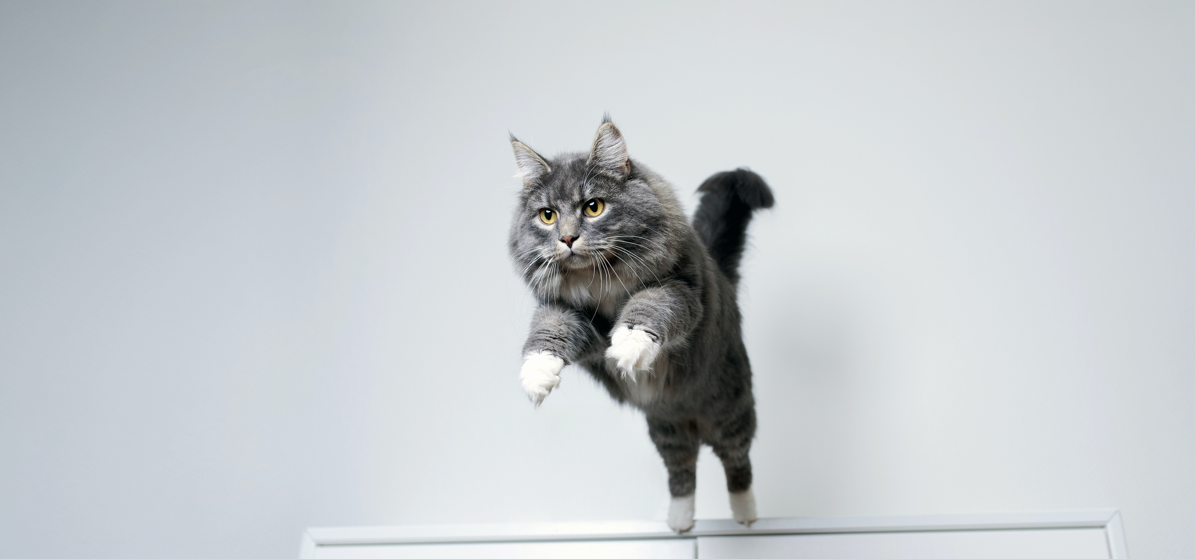
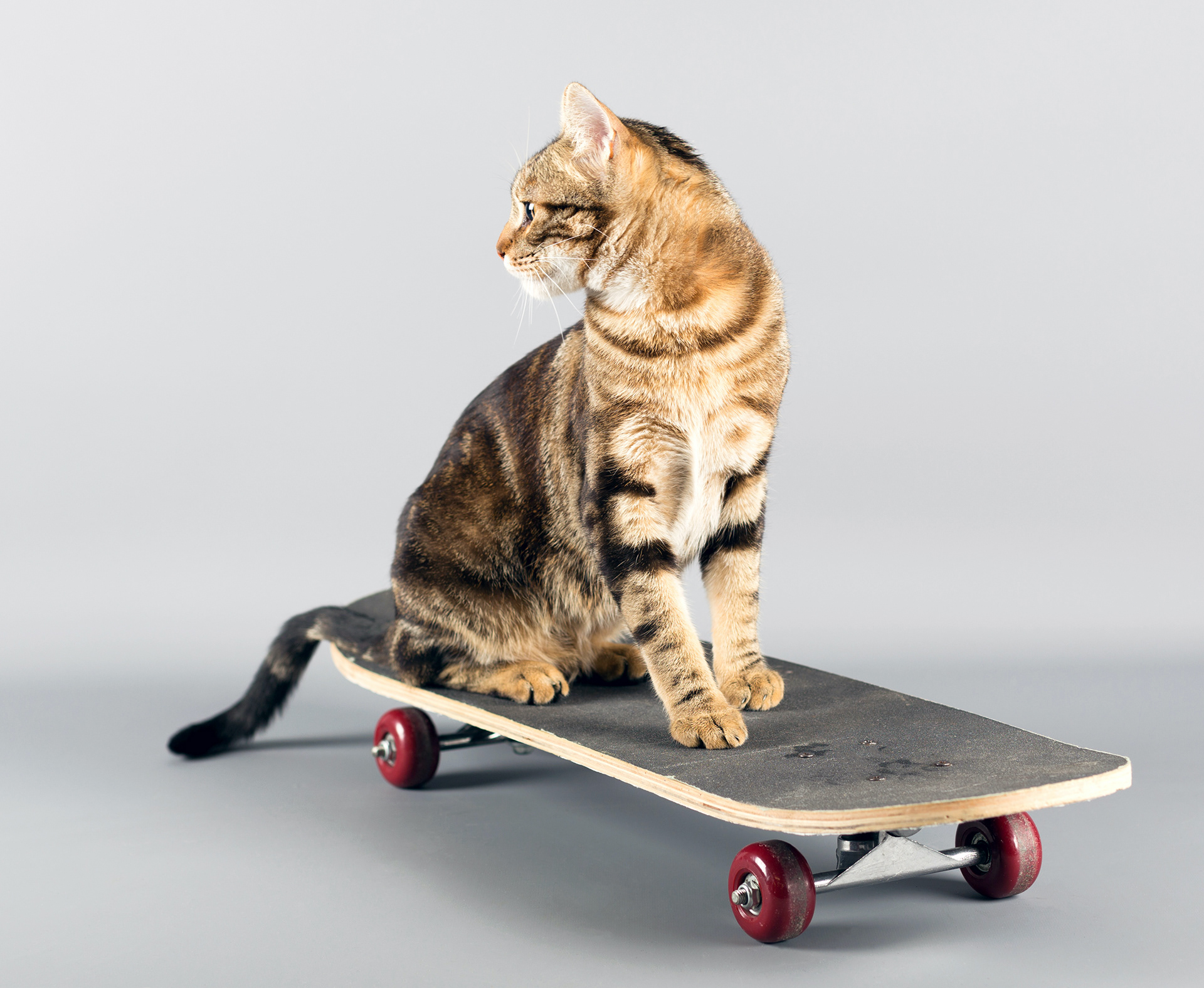
The Cat Olympics 2021 is an event where these pets shine as true Olympic competitors. These felines are, just like the real athletes, skilled in several sports, including skate, athletics, and karate.
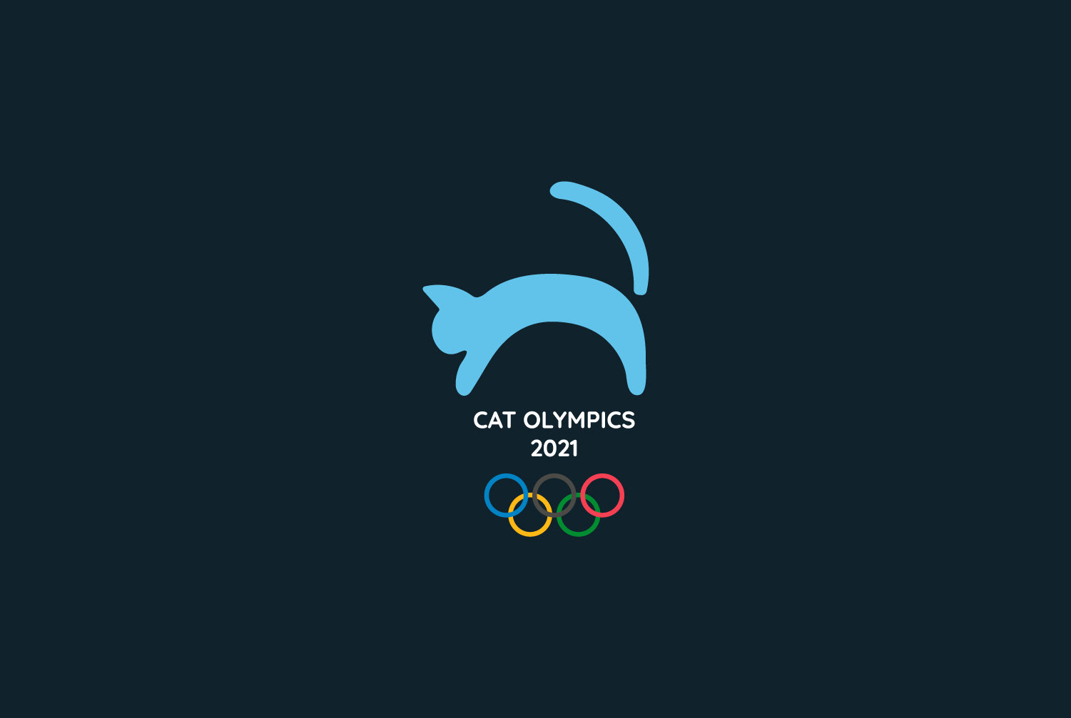
The logo maintains the traditional Olympic circles combined with the symbol of a cat leaping forward. In combination, the geometric shapes and the organic cat produce a balance and dynamic outcome that fits in with the movement of the competition.
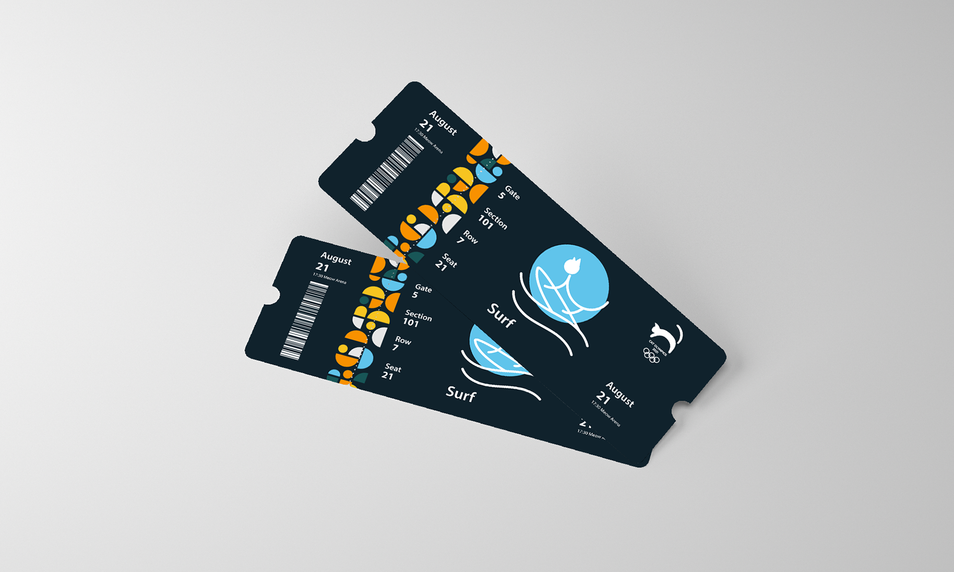
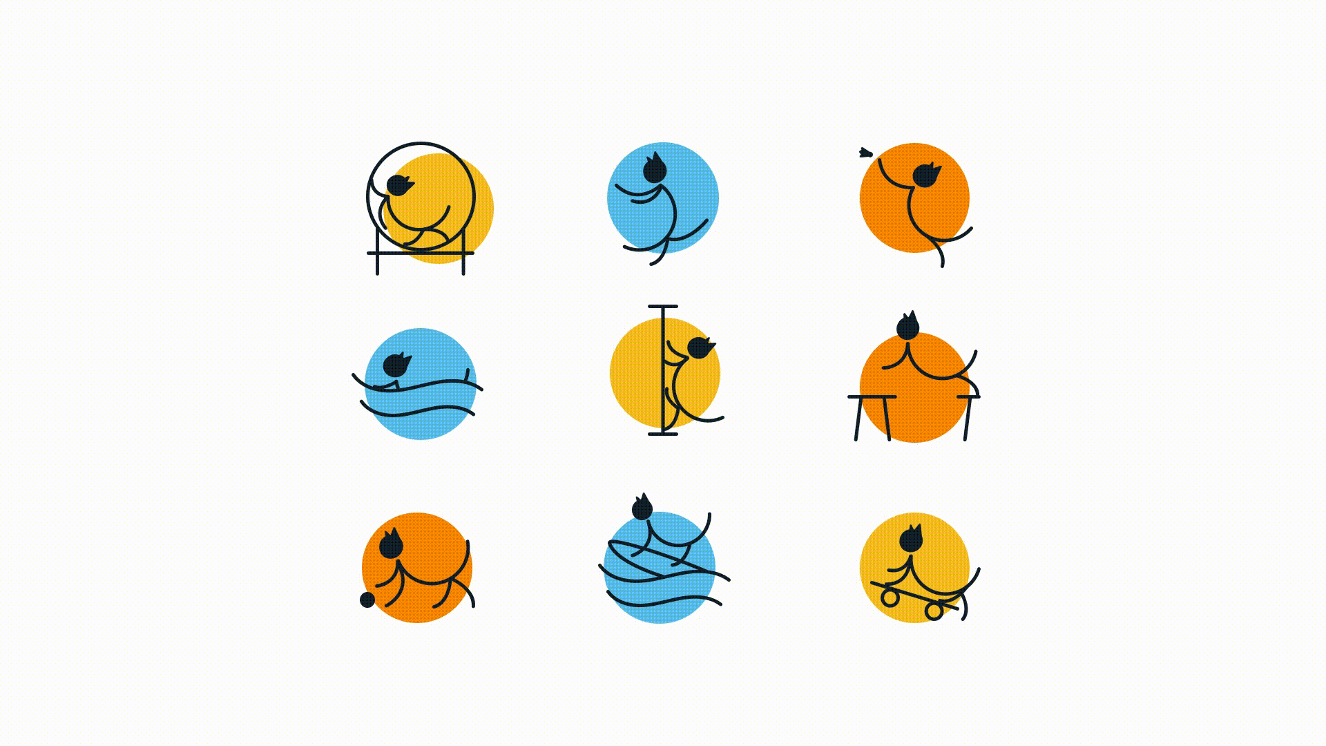
We chose a color palette that represents the multitude of sports and the competitors' different personalities. Light blue represents focus and water sports, and orange symbolizes creativity and jumping sports. Additionally, yellow stands the cheerful spirit and newest urban sports. Dark green and light grey serve as secondary colors to this palette.
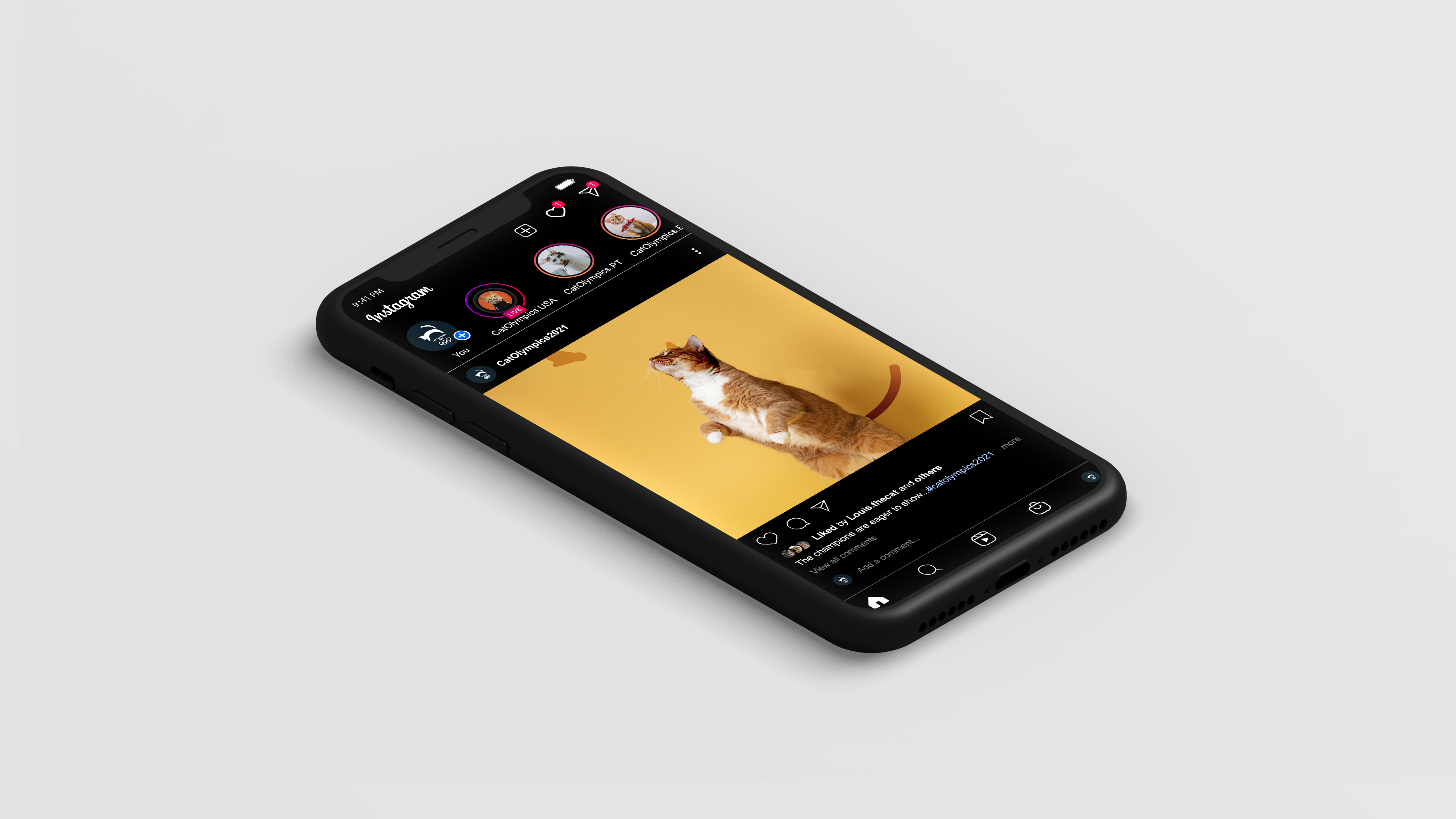
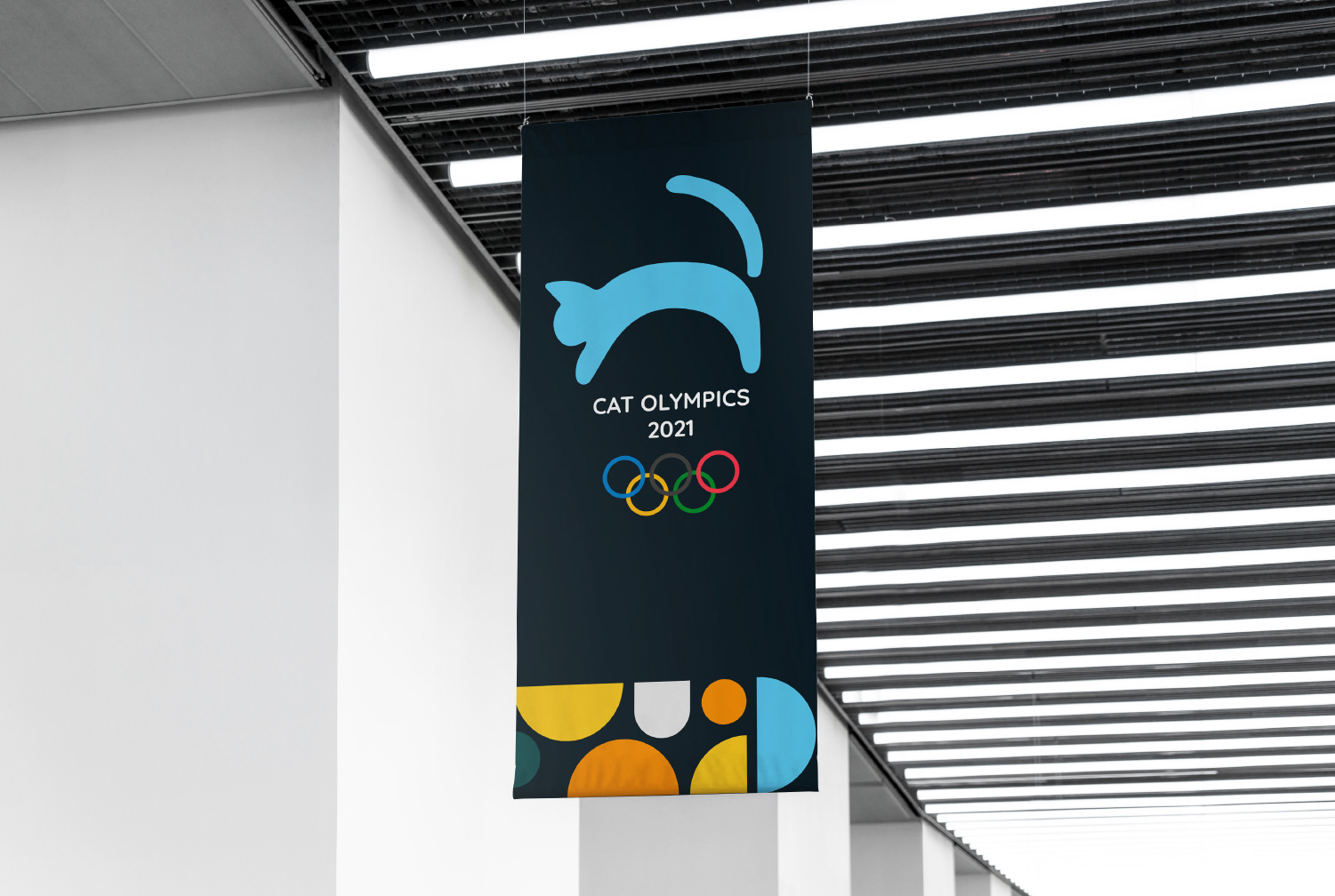
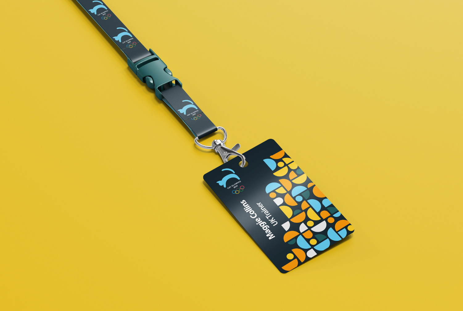
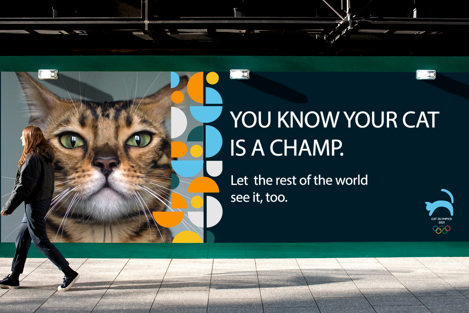
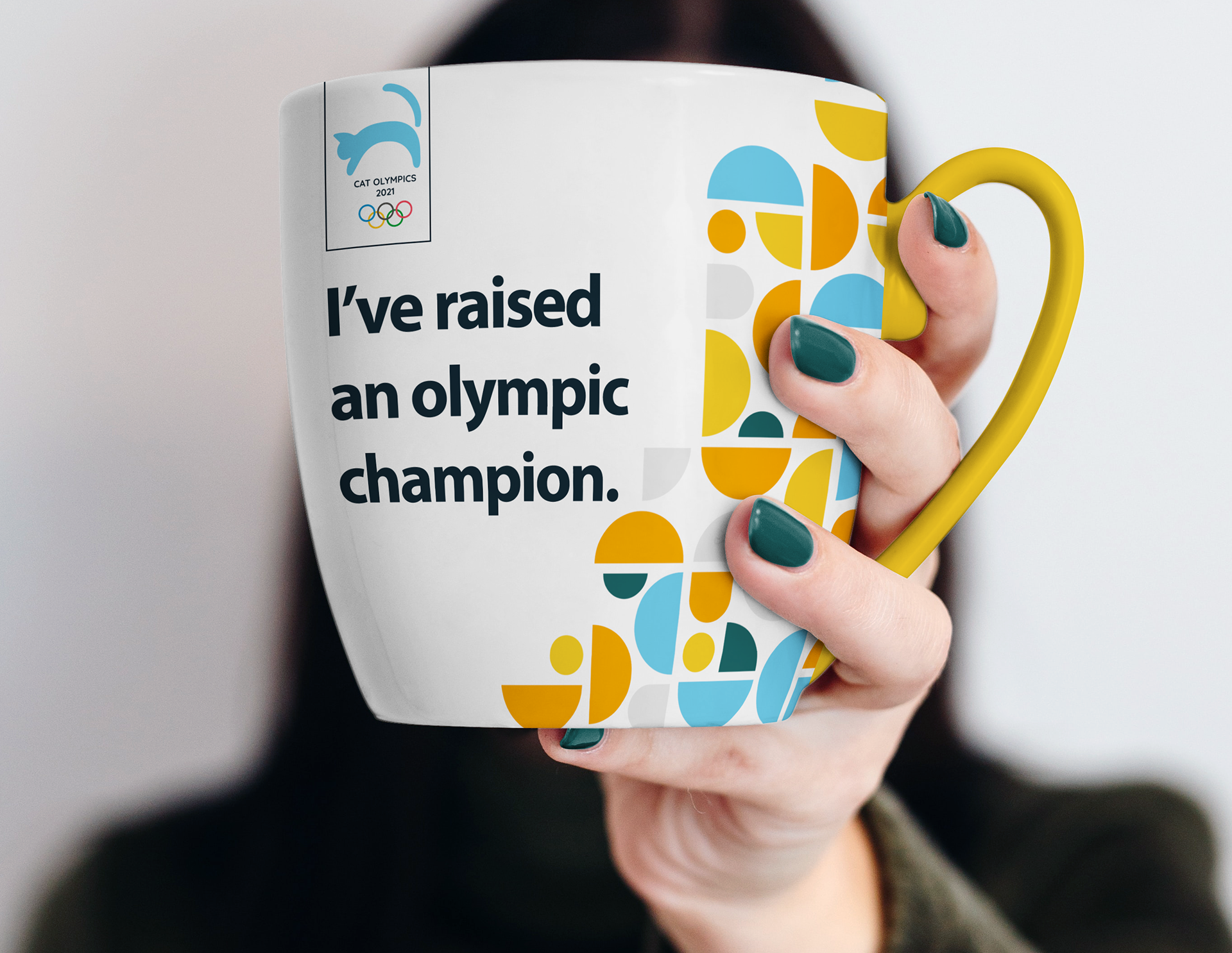
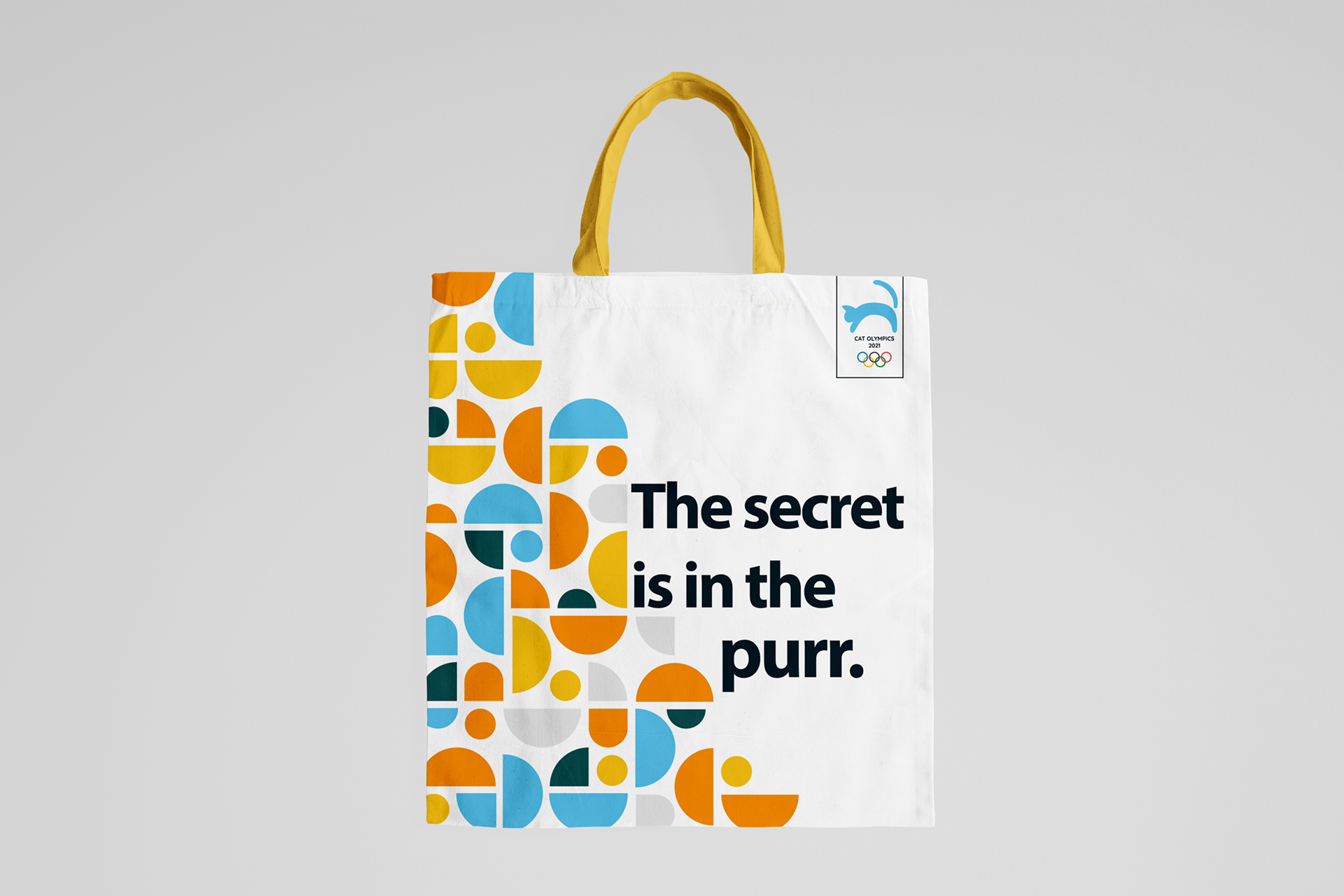
To showcase different applications of the event, we paired a custom geometric pattern with high-quality photography and carefully planned copy.
Copywriting
Raising a pet is great. Sharing the house with an Olympic cat athlete is a whole other level of pride and admiration.
We decided to highlight the idea of publicly showing the honor of having a pet that shines in high-level competition with straightforward communication.
By creating merchandise products and outdoor pieces with bold and engaging copy, we appeal to everyone involved: spectators, owners, and trainers.
Iconography
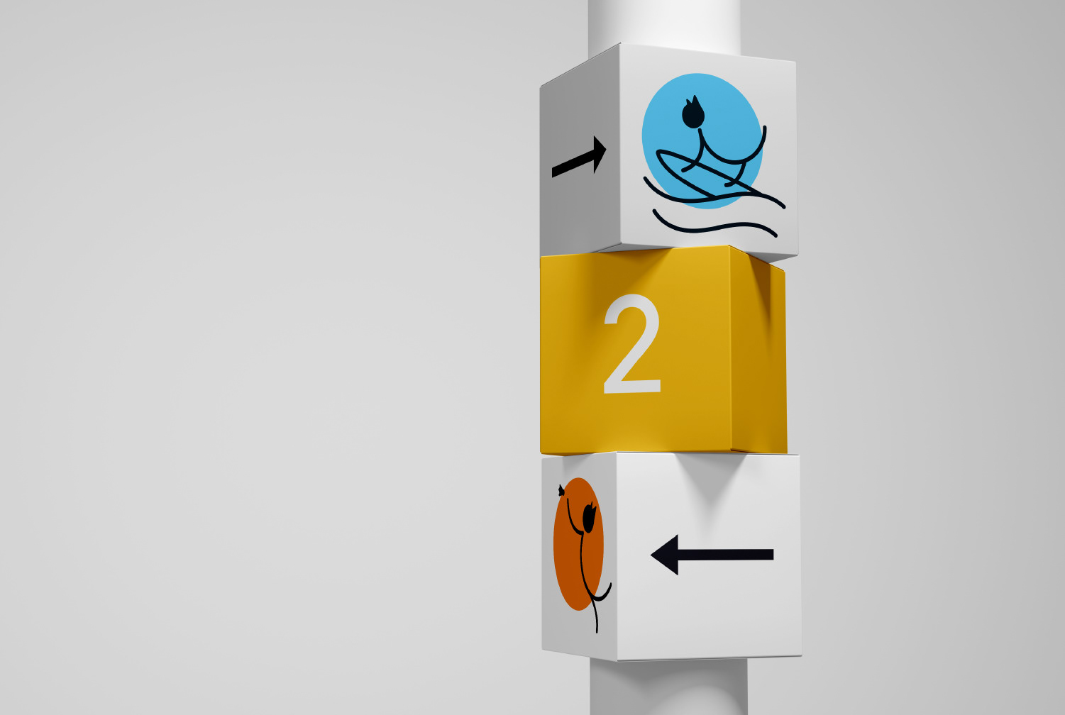
We used history research as inspiration to create an identity that could stand alongside the Olympic's past ceremonies. Our goal was to create iconography that identified each of the categories and served as visual clues on the event.
We opt for pairing the iconography with a colorful geometric background to tie the complete identity and make it look and feel cohesive. This set was used in official channels to synthesize information and communicate effectively.