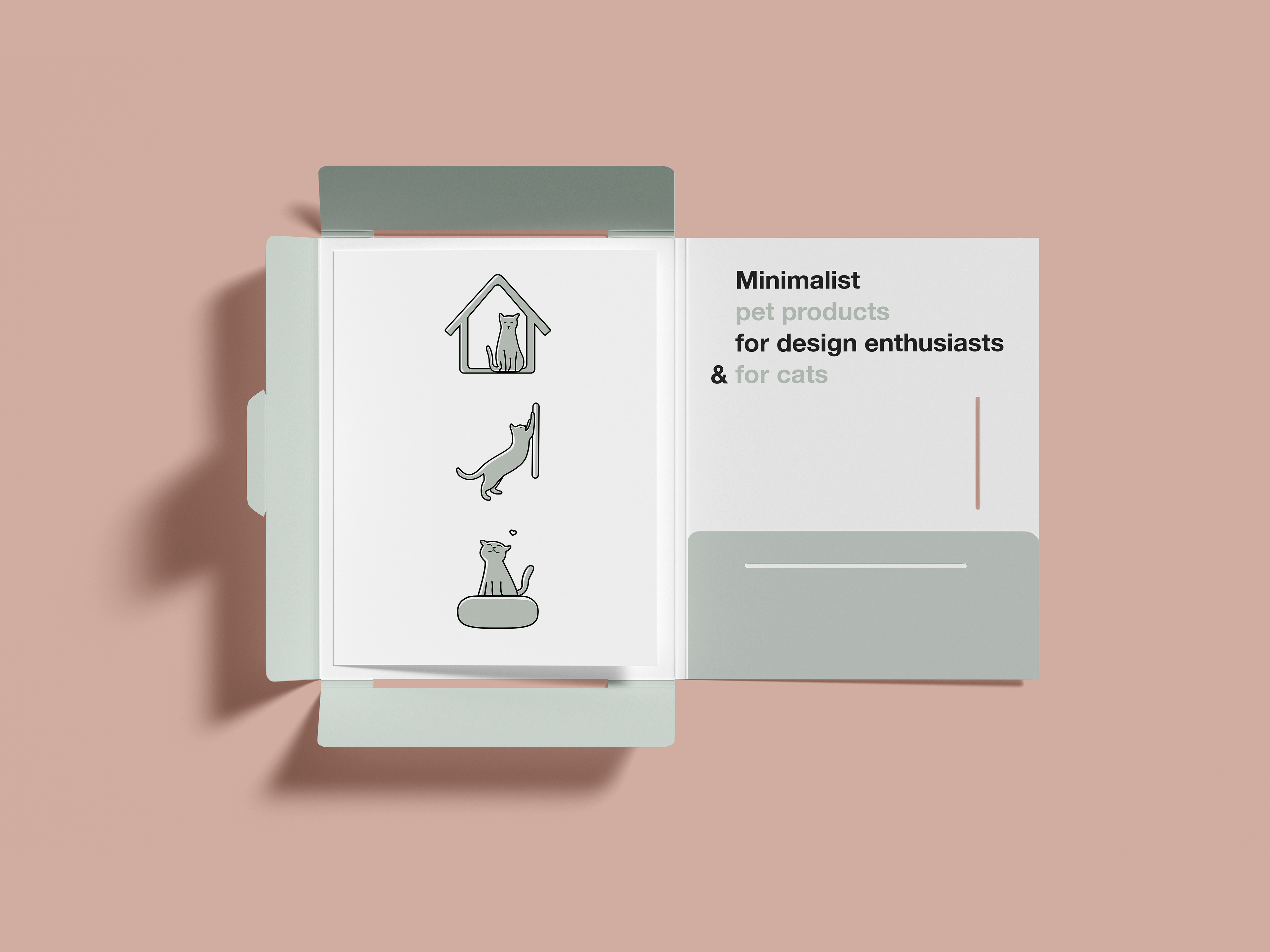
With clean and minimal design, Noots is a Canadian brand for pets and pet owners.
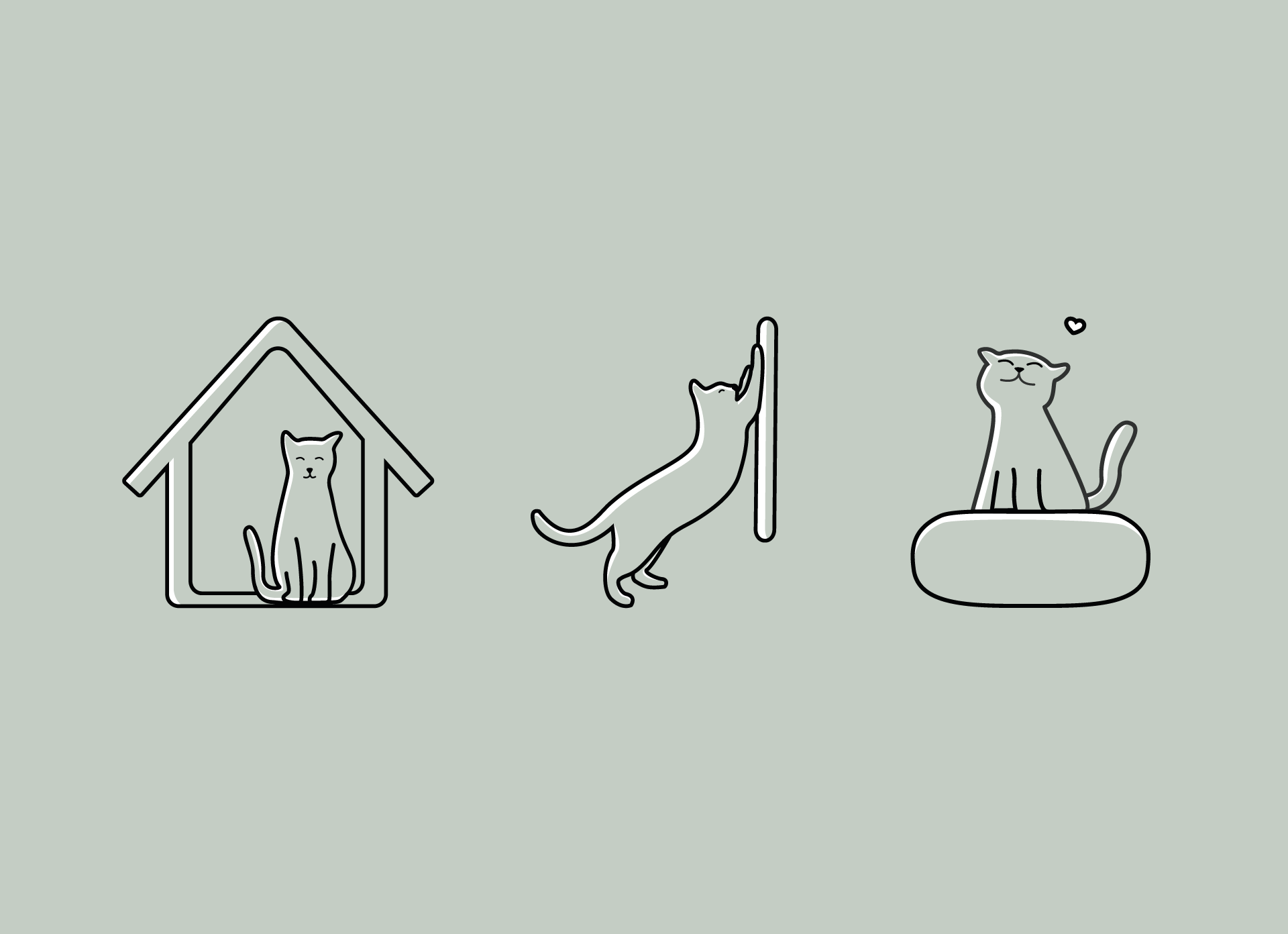
Josephine, the owner of Noots, reached out to don Gata studio for a new set of icons that represented Noots brand goals and attitude towards its products.
Josephine, the owner of Noots, reached out to don Gata studio for a new set of icons that represented Noots brand goals and attitude towards its products.
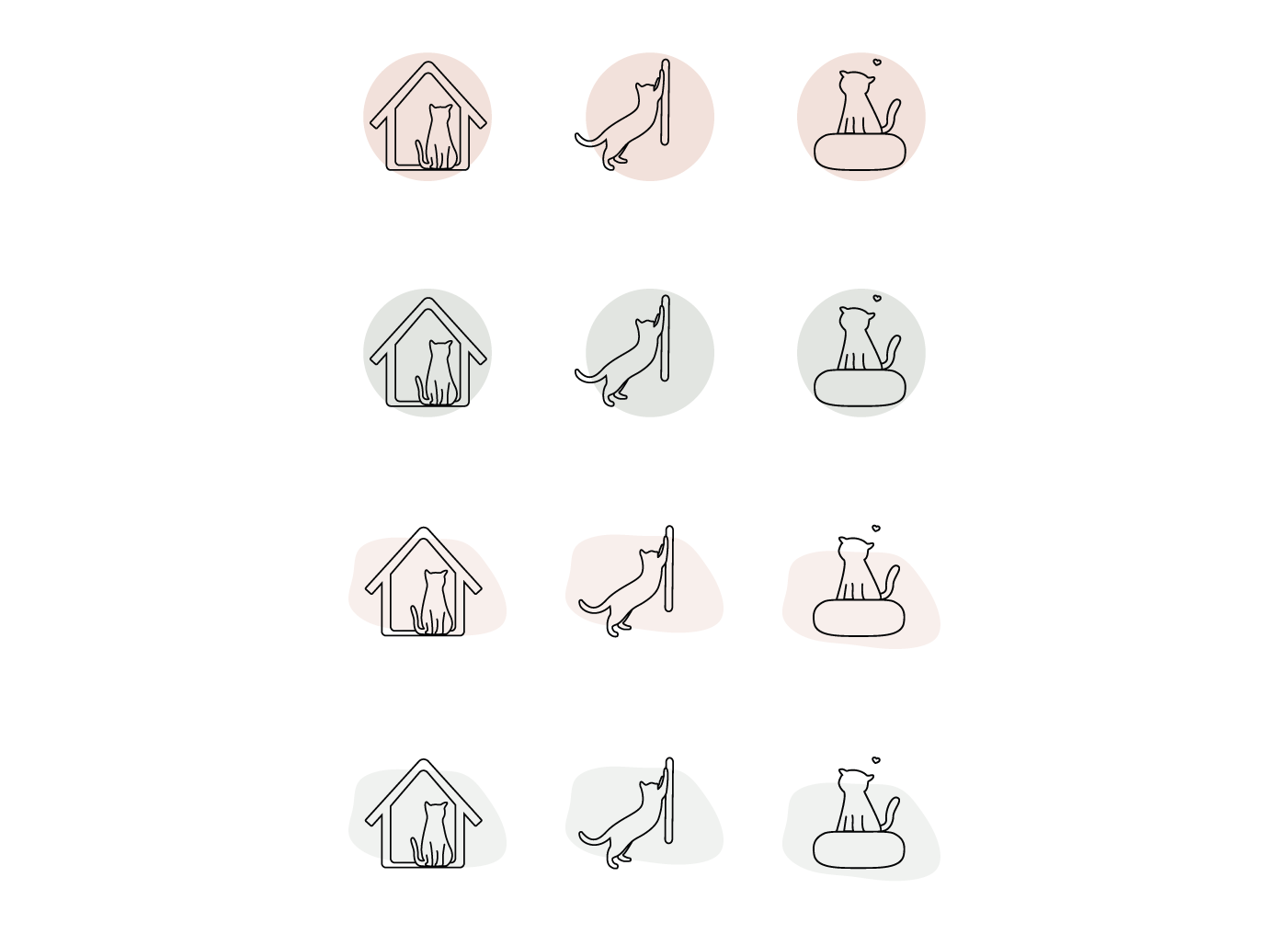
From an early stage in the project, we decided to minimize color usage to keep the set clean and cohesive with the existing brand elements.
Within the existing brand color palette, we opted for green to offer a deeper contrast with the prominent color, red, as well as to make the set of icons stand out from other elements on the website.
After testing different styles and shapes, we introduced human features, making the icons approachable and friendlier.
Content writing
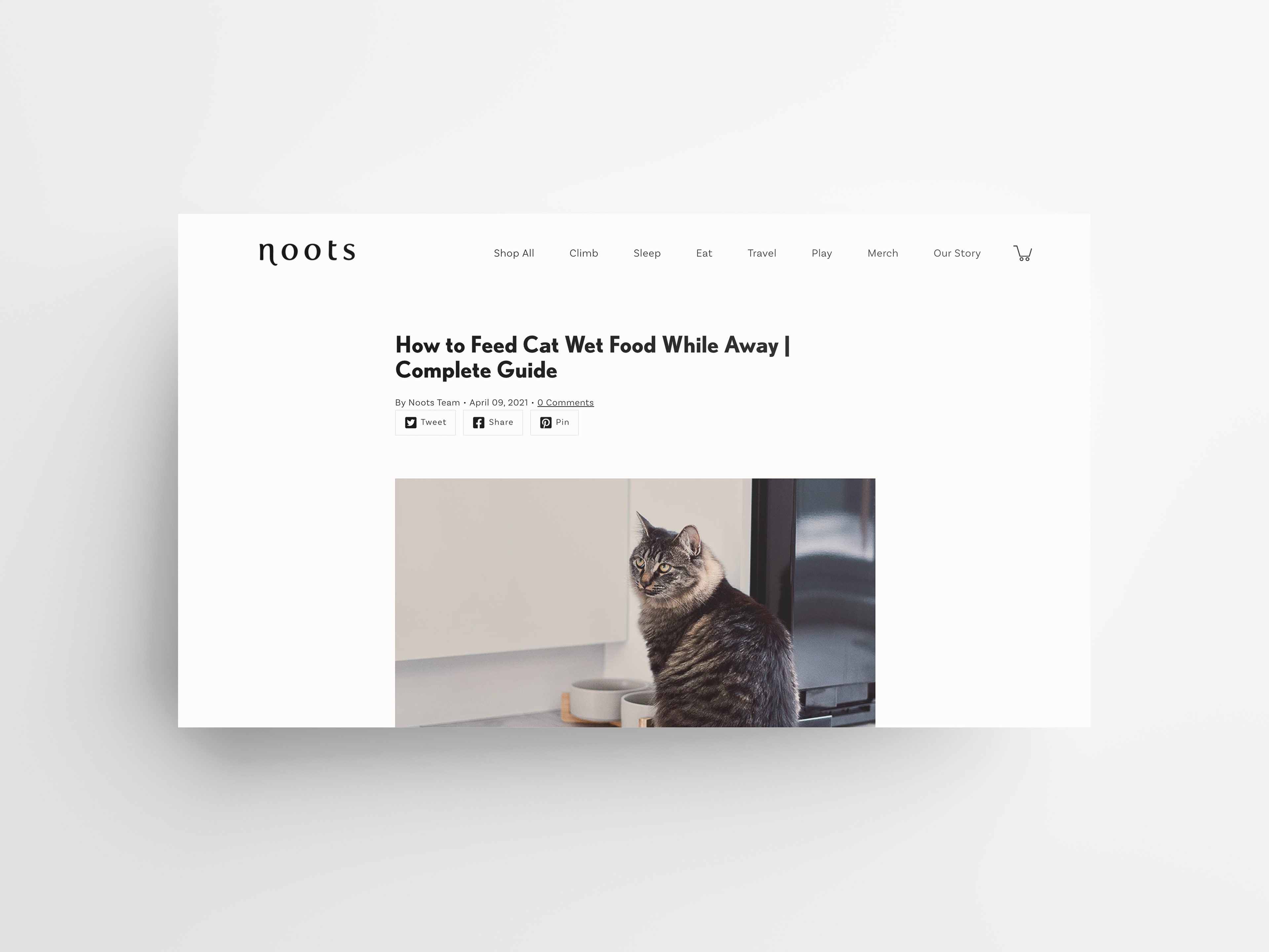
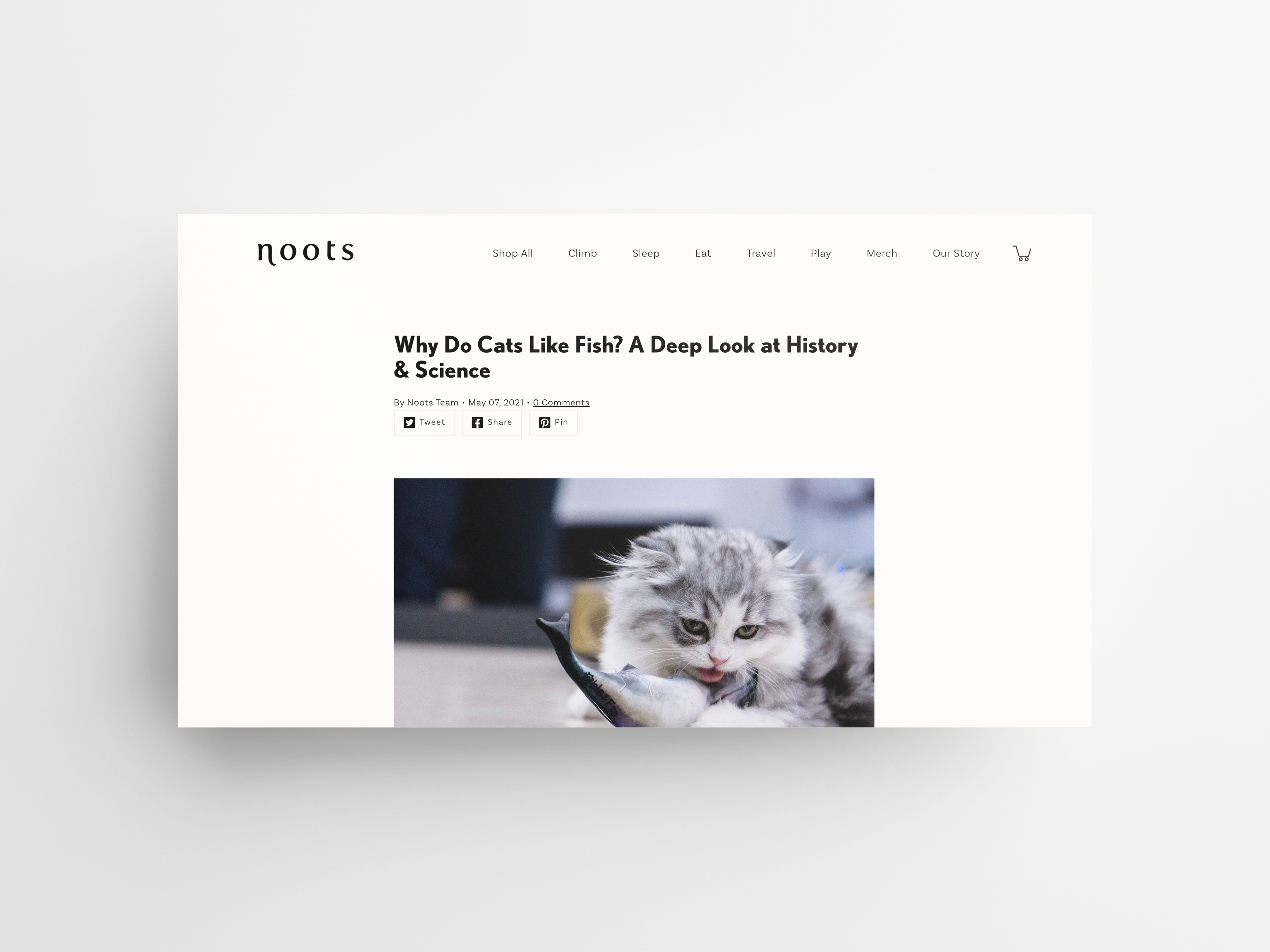
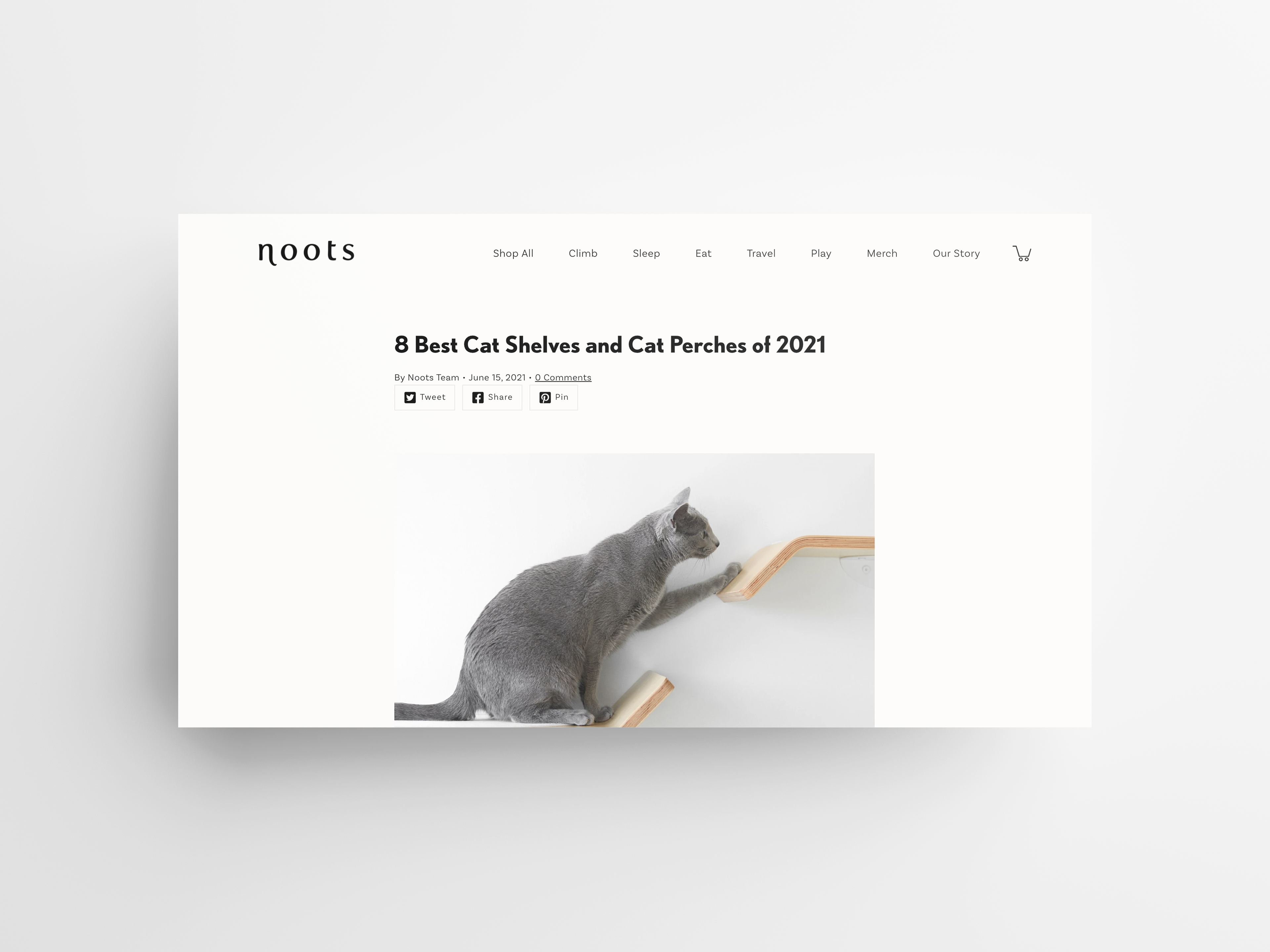
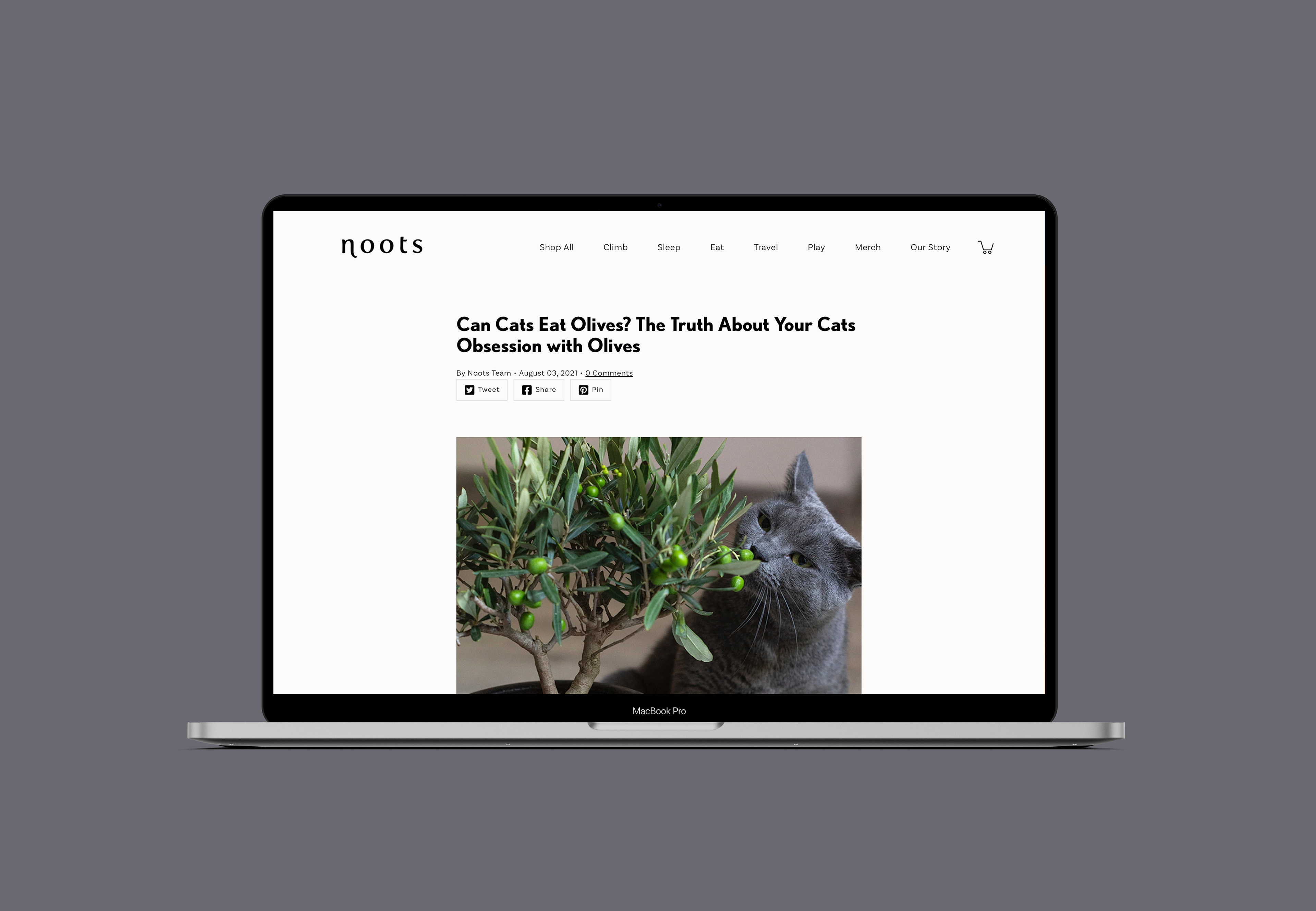
Besides visual elements, Noots also commissioned us to develop a set of blog posts.
These articles are an extension of the brand and convey knowledge on all things cats, product-related and otherwise. They help establish authority and recognition within the cat community and reach a broader audience that can convert into potential buyers and loyal consumers.
In partnership with Josephine, we delimited a long-term strategy for the blog area. In this space, frequent doubts and a new light on current topics and trends are explored.
Each post is written following a similar layout, illustrated with images and graphics, and optimized to produce the best SEO results.